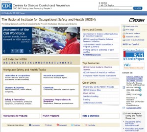
Making of the New NIOSH Homepage
Posted on byWhat you told us
Did you catch the St. Patrick’s Day launch of the new, streamlined NIOSH homepage? For those expecting a routine makeover, we want to take you behind the scenes. For over four years, the NIOSH Web Team has collected information through user testing and from feedback and discussions with users. We heard that the homepage was “link-heavy,” “busy,” “overwhelming,” and “a little dated.” Users told us they were distracted by too many links and found it harder to focus on finding what they wanted. The message was clear. A simpler interface design would make life easier.
What the numbers told us
Web statistics gave us more information on how visitors use the site. The stats told us that most users rely on the homepage for general directory information through the NIOSH topic page indexes, A-Z list, and search. A few specific resource links got good traffic, like the NIOSH Pocket Guide to Chemical Hazards and the NIOSH Manual of Analytical Methods. Many other links on the homepage were rarely clicked.
What a cognitive assessment told us
A cognitive design assessment of the homepage looked at how well the graphic features and layout reflected our users’ preferred search and navigation styles. Like the earlier user testing, the assessment showed information overload was a big issue. The testing also showed that the homepage was missing graphic and other visual cues that help users navigate. On the content side, the cognitive review revealed the need for more descriptive and less ambiguous heading names for groups of links.
How we changed
The information from the evaluation activities was used by the NIOSH Web Team and Information Architecture Workgroup to redesign the homepage with several key changes:
- Low-traffic items were eliminated or consolidated. Three groupings were created that could be accessed from a dropdown menu – “Publications & Products,” “NIOSH Programs,” and “Data & Statistics.” Items in these menus are revealed when the user rolls over the headline link.
- Low usage items were relocated. Links that were not accessed often and those perceived by users as a distraction were reorganized and moved to areas where they don’t compete for attention with higher usage information.
- Added an animated page banner. The animated banner module replaces the former page banner that used a static image. This adds page interest and does a better job of attracting attention to major initiatives and high profile events.
- Improved information clarity. To remove any confusion over collections of information, we looked for names that clearly describe the collection. While we are still looking for a better name for “Quick Links,” the former “Spotlights” section was retitled “News and Events.”
Results?
These changes reduced the number of visible links on the homepage by nearly half. The result? A streamlined look that is easy and quick to navigate. We expect that more regular and visible activity in the animated banner and “News and Events” sections will draw visitor interest and improve the site’s search engine “attractiveness” to search engines.
Where we’ve seen immediate improvement
- Visitors stay longer. Immediate exits dropped by about 2.5%.
- Popular pages are even more popular. Nine of the traditional top ten links received more clicks in the new version.
- Streamlining the page with dropdown menus performed well with increased clickthroughs on publications and specific program pages.
Do the homepage changes work for you? Tell us what you think. Let us know if there is anything that would improve your experience on the NIOSH Web.
Donna Van Bogaert, Ph.D.; Juliann Scholl, Ph.D.; Chris Storms, B.A.
Dr. Van Bogaert is the Chief of the NIOSH Information, Resources, and Dissemination Branch.
Dr. Scholl is the Senior Team Lead, Information, Resources, and Dissemination Branch.
Mr. Storms is a Health Communication Specialist, Information, Resources, and Dissemination Branch
Posted on by
Page last reviewed: November 25, 2024
Page last updated: November 25, 2024
Content source:
Centers for Disease Control and Prevention


