Evolution of the NIOSH Logo
Posted on by
The NIOSH logo is recognized by workers, employers, and safety and health professionals worldwide. When the logo appears on a document, website, certified respirator, or other product it tells the user that the information or product is backed by NIOSH state-of-the-art research and expertise.
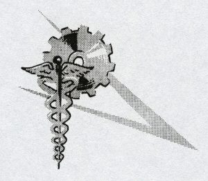
The NIOSH logo has evolved over time. Figure 1 shows a logo used by the NIOSH predecessor, the Bureau of Occupational Safety and Health, in 1968. Figure 2 shows what was used on a NIOSH Technical report from 1978.


The logo in Figure 3 is what was used during much of the 1970s-1990s. The official colors were red, blue, and gold. If interpreted broadly this logo symbolized work and health. However, a narrower read of the symbology could be medicine and manufacturing. Given that NIOSH uses tools beyond medicine (such as industrial hygiene, epidemiology, and engineering) and protects workers in all workplaces, not just manufacturing, an update was warranted.
A revised logo was unveiled at the NIOSH 25th anniversary in 1996 (Figure 4). This streamlined and modernized logo drew from the block lettering of previous versions the logo, while creating a forward-looking aesthetic that communicates movement towards the future. The new logo allows more design flexibility while still invoking the NIOSH brand. This logo design also better aligns with the Centers for Disease Control and Prevention branding (see Figure 5).


This year NIOSH celebrates its 50th anniversary. While the logo has evolved over the years, it continues to symbolize scientific excellence in occupational safety and health research and prevention. Workers and employers know that the NIOSH logo represents quality information they can trust. The NIOSH logo will continue to signify first-rate science, experience, and knowledge for protecting America’s workers.
 This blog is part of a series for the NIOSH 50th Anniversary. Stay up to date on how we’re celebrating NIOSH’s 50th Anniversary on our website.
Julie Tisdale-Pardi, MA, is the NIOSH Science Blog Coordinator
Posted on by

