Changing with the Times: The Journey to Interactive Charts
Posted on by
Our world is constantly evolving. Computers that used to occupy an entire room now fit in the palm of our hands. Information that used to require hours of searching, sorting, and reading is now available with the click of a button. Similarly, the way NIOSH shares work-related public health surveillance data has evolved to address research needs and technological advances.
Bringing Data Together
Public health surveillance is the ongoing systematic collection, analysis, and interpretation of health-related data. Public health surveillance data that focus on workers have many important uses such as identifying industries and occupations with the highest risk for injuries and fatalities. Data are collected by:
- federal, state, and local agencies
- private industries
- insurance companies
- workers compensation programs
During a National Advisory Committee on Occupational Safety and Health (NACOSH) meeting in 1998, attendees identified a need for a single document that summarizes data from various sources. NIOSH committed to developing this document with input from the Bureau of Labor Statistics (BLS) and Occupational Safety and Health Administration (OSHA).
Enter the Chartbook
In 2000, NIOSH published the Worker Health Chartbook. The first of its kind, the Chartbook cont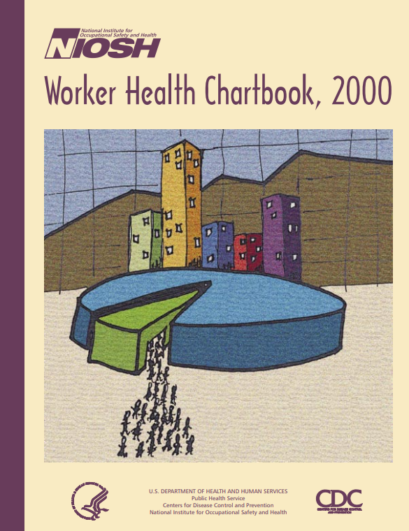 ained worker safety and health surveillance data. The data were provided by collaborators, including CDC, BLS, the Mining Safety and Health Administration (MSHA), and other agencies, to make it easier to find comprehensive worker health and safety information.
The information within this 272-page book was split up by:
- fatal injuries
- fatal illnesses
- nonfatal injuries
- nonfatal illnesses
The book also included a special section that focused on the mining industry.
Though the Chartbook was considered innovative at the time, there were gaps in the data and room for improvement.
Evolving the Format: Keeping the Users in Mind
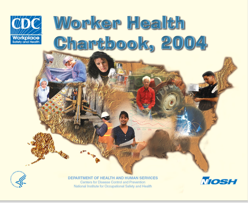 Over time, data presented in the Chartbook became obsolete and a much-needed update was warranted. In 2004, NIOSH released the second edition of the Worker Health Chartbook. While the overall objective was the same, it was a more comprehensive and user-friendly product. Changes started with the cover; instead of stick figures, NIOSH chose faces to represent America’s diverse workforce. More federal, state, and industry collaborators were also included, which allowed emphasis on specific industries (e.g., agriculture, construction) and special populations (e.g., young and aging workers). Credit was given to the people who developed the charts, not just the agency or organization from which the data came. This gave users specific contacts to get more detailed data.
Most importantly, the second edition of the Chartbook considered users’ needs:
- It used a question and answer format, creating a more simplistic approach to answer worker health-related questions with supporting charts and data.
- Chart colors were chosen to consider people with color blindness.
- A compact disk (CD) that contained an electronic version of charts was included in the book so that people could download and add the charts to their reports.
In 2005, the 2nd Edition of the Worker Health Chartbook won an Alice B. Hamilton Award for Best Educational Material.
The Chartbook Steps into the Digital World
In a technology-dominated world, the Chartbook needed to stay relevant. In 2007, NIOSH released the fully online edition of the Chartbook. Called the eChartbook, it included over 8,000 static charts related to worker health and safety data from BLS. These charts were categorized by industry sectors. Within each sector, users could click on links to see charts displaying information on injuries, illnesses, musculoskeletal disorders, demographics, work characteristics, and exposure. Users also had the option to look at more detailed industry data.
While the eChartbook provided online access to very detailed BLS data, it took a step backwards by not providing data from other agencies and collaborators like the previous Chartbooks. This undermined the original objective of the Worker Health Chartbook, which was to provide a document that summarizes data from different sources. Users had to browse through thousands of charts to find the chart they needed, which was time-consuming. Generating and publishing thousands of charts every year was a huge undertaking for NIOSH.
Things Become Interactive with Worker Health Charts
Data visualization moved to the forefront within public health and provided a new opportunity for sharing workplace surveillance data. In 2016, the Chartbook evolved into a user-friendly, interactive data query and visualization tool called the Worker Health Charts, which is still used today (see example below). Worker Health Charts allows users to easily explore and chart data to answer questions related to workers’ health. It also provides access to data from multiple data sources, such as BLS, National Health Interview Survey (NHIS), Behavioral Risk Factor Surveillance System (BRFSS), Adult Blood Lead Epidemiology and Surveillance (ABLES) program, and the SENSOR-Pesticide program (Sentinel Event Notification System for Occupational Risk).
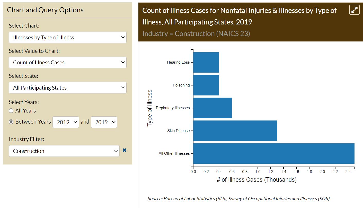
Some of the latest Worker Health Chart features include:
- A keyword search
- Filter and grouping functions
- The ability for users to simply click on data displayed in a chart to see more detailed information (e.g., industry, occupation)
- A share and export button to allow users to send the charts they create to their colleagues, copy and paste a chart citation, or download the data into Excel
Try out Worker Health Charts yourself, or learn more about how to create charts.
Continuing to Evolve
The Worker Health Charts tool is among the first of its kind and future upgrades and improvements will continue to be implemented to enhance user experience, such as:
- incorporating data from other sources, such as the National Occupational Mortality Surveillance program (NOMS) and Fatalities in the Oil and Gas Extraction Industry (FOG) database, and
- improving the user interface to continue to improve the user experience.
Over the last 20 years, the Worker Health Chartbook has evolved into the interactive Worker Health Charts tool and will continue to evolve as technology advances. If you have ideas for how we can improve Worker Health Charts, please share in the comments below. We are always looking for new ways to evolve and improve how we share worker health and safety surveillance data with others.
Mike Reh, BA, is a summer Collegiate Leaders in Occupational Safety and Health (CLOSH) student in NIOSH’s Health Informatics Branch in the Division of Field Studies and Engineering.
Rebecca Tsai, PhD, is an Epidemiologist in NIOSH’s Health Informatics Branch in the Division of Field Studies and Engineering.
Amy Mobley, MEn, is a Health Communications Specialist in NIOSH’s Health Informatics Branch in the Division of Field Studies and Engineering.
The authors would like to thank John Sestito, JD, MS, for his assistance in preparing![]() this blog.
this blog.
This blog is part of a series for the NIOSH 50th Anniversary. Stay up to date on how we’re celebrating NIOSH’s 50th Anniversary on our website.
Posted on by