Have it Your Way: Exploring Data on the National Environmental Public Health Tracking Network
Posted on by“Have it your way.” Remember that old marketing promise from a fast food chain? In this case, rather than a hamburger, the phrase is in reference to the treasure trove of environmental and health data on CDC’s Environmental Public Health Tracking Network (Tracking Network).
There are currently 450 environment and health measures accessible in a variety of ways…which brings us back to having it your way.
As the Tracking Network has grown over the years, so has the recognition that users require a variety of ways to ask for and consume the information they are seeking from the Tracking Network. In the same way that not everyone likes mayo and tomatoes on their hamburger, not everyone who is trying to learn about the environmental health of their community wants to access and use Tracking data in the same way. To address different preferences of different users, the Tracking Network provides several options to search for and visualize the mountain of information available: the Data Explorer, Info By Location, and the application program interface, or API.
Tracking’s Data Explorer
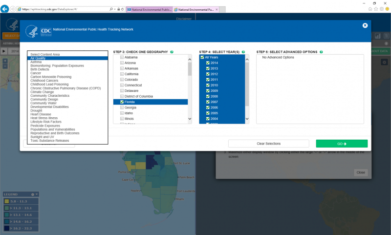
Users who want to do a deep dive into the available data should check out the Data Explorer. After selecting type of content, geographic level, and time periods of interest, the Data Explorer returns the results in an interactive map, chart, and table. Each of these different visualizations is fully customizable and exportable. One of the unique things about the Tracking Network is the amount of data that is available across multiple years. This attribute allows for some very powerful visualizations in the form of animation over time. With the simple click of the “play” button located in the top left corner of the map (or chart), the Data Explorer will cycle though each of the selected years and show a living map of environmental health data.

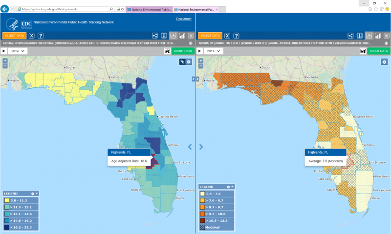
But, that’s only half of the Data Explorer story! The Data Explorer defaults to a split screen view and all of the features described above operate on just half of the available screen. From a functional standpoint, each side of the screen provides the same abilities and is completely independent unless the user choses to link them. In other words, Tracking data can be searched for, visualized, and manipulated on each side of the split screen to view multiple, concurrent views of the data. Do you have a need to animate different maps over time and view them side-by-side? Have it your way!
Because there is no restriction on what types of data users can visualize in the Data Explorer’s split-screen view, it provides a unique ability not often found in public health surveillance systems—the ability to visualize multiple environmental or health measures at the same time.
The multiple measure query and display functionality provides an exciting capability to the Tracking Network and increases a user’s ability to freely explore and analyze data on the Network. Now more than ever, public health practitioners and other users can formulate hypotheses, analyze trends, and explore possible relationships across a wide variety of health and environmental information. Do you want to visually explore possible relationships between air quality and asthma hospitalizations? Have it your way!

Tracking’s Info By Location
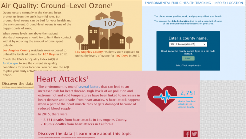
While the Data Explorer is powerful and comprehensive, some users prefer to be given what is important about their location rather than search for it themselves. They want to have it their way. To that end, the Info By Location (IBL) feature presents simple, easy-to-digest information about a county’s environmental health. After the user enters their county name or zip code into IBL, the system creates and displays a series of infographic-style visualizations of some environmental health measures on the Tracking Network. IBL visualizations quickly communicate key data points with short passages of descriptive text. This format is perfect for users who may otherwise be intimidated or overwhelmed by the Data Explorer option.

Tracking’s Application Programming Interface
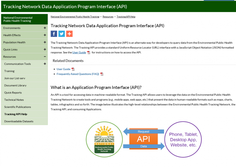
Like restaurants, the Tracking Network provides a menu of options for accessing data. But, sometimes the standard items might not be what is wanted. Everyone has a different idea of what their way is! To better help users get data how they want and need it, the Tracking Network provides a public Web-based data connection, called an Application Programming Interface (API), to the Tracking data repository. The API gives developers, scientists, and the public programmatic access without the limitation of a predefined user interface. The Tracking API functions similarly to other APIs currently available on the Internet. Its data inputs and outputs are easy for humans to understand, yet efficient for machines to generate and analyze. With this feature, application developers are empowered to build innovative user interfaces and data visualizations around the 1.1 billion rows of available Tracking data. One of the greatest advantages of the API is that any applications connected to it will automatically receive data updates and refreshes, preventing the data from becoming stagnant.

The Tracking Network has environmental health data and information for all kinds of users. Whether you are a data wonk mining for unique and undiscovered data insights, someone’s parent who just wants to know the important stuff, or an app developer with a brand new idea for using this information, the Tracking Network provides a set of flexible tools and data so that you really can “have it your way.”
Tweet this: “Check out the treasure trove of environmental and health data on CDC’s Environmental Public Health Tracking Network (Tracking Network). Go to https://bit.ly/2EHDYKO #CDCEHblog via @CDCEnvironment”


Post a Comment