Data on the Forefront: How CDC Keeps Measuring Progress and Targeting Action
Posted on byBy Loria Pollack, MD, MPH
Senior Medical Epidemiologist
 April is National Cancer Control Month. The term “cancer control” might sound abstract—like something that should be left up to scientists or experts. But that’s far from the truth!
This month, with the release of CDC’s updated United States Cancer Statistics Data Visualizations tool, it’s clearer than ever to get information on where cancer occurs and who is impacted most. The Data Visualizations tool is interactive—with charts, graphs, and maps in full color—showing that cancer control is grounded in data. Now, every partner will be on the same page when they come together to work for common goals to prevent and control cancer. Anybody, anywhere will be able to see, share, and use the latest cancer data to target action toward fewer people getting cancer.
Cancer Control Is Public Health
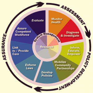 The first week of April is also National Public Health Week. As a doctor focusing on preventing disease, and as someone who works to protect the nation’s health and safety, I try to keep the mission of public health in mind. You can find out more about the goals of public health on CDC’s Essential Public Health Services web page. These goals help me to focus my work and apply it directly to controlling cancer, a leading cause of disease and death. An important way that my team and I do that is by using data. Data allow people like me to monitor health in communities, whether that is a small area or the entire country. High quality, reliable cancer statistics mean we can accurately track who is getting cancer and what types of cancer are increasing or decreasing.
It’s Not Just Numbers—It’s People
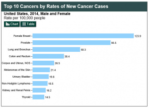
The way that we get these statistics is by collecting information on cancer cases from all over. Clinics, hospitals, and laboratories record and report information when someone is diagnosed with cancer—they’re required to by law. The patients’ names are removed, but the facts are collected by cancer registries. CDC’s National Program of Cancer Registries (NPCR) and the SEER program of the National Cancer Institute together collect data on cases diagnosed in every U.S. state and in three territories. That’s more than 1.7 million cases every year!
The point of putting these data together is to educate people, to tell them what puts them at risk for cancer. It also lets communities create programs to promote healthy behaviors and make environmental and systems changes that prevent cancer. One great example: over many years, data have shown that education about the dangers of tobacco, smoke-free policies, and other cancer control strategies have helped make lung cancer rates to go down. Lung cancer is the biggest cancer killer of both men and women, and smoking is the number one cause. If fewer people smoke, that can mean fewer people may get lung cancer and die from it. The USCS Data Visualizations graph above shows the progress in lowering lung cancer deaths.
Good Data Drive Partnerships for Health
Good data drive everything public health does. Showing these data in an understandable way means everyone involved can work smarter and do more good. Cancer registries are part of this partnership. They don’t just collect numbers without looking at the “how” and “why.” Instead, they join with comprehensive cancer control coalitions, which are networks of partners at many levels that team up to control cancer’s impact. This is why, as someone invested in public health, I’m really proud of what goes into making the U.S. Cancer Statistics Data Visualizations tool complete and correct, and the great cancer control work that comes out of it—for everyone’s health!
Posted on by